Find your spot. Custom boundaries
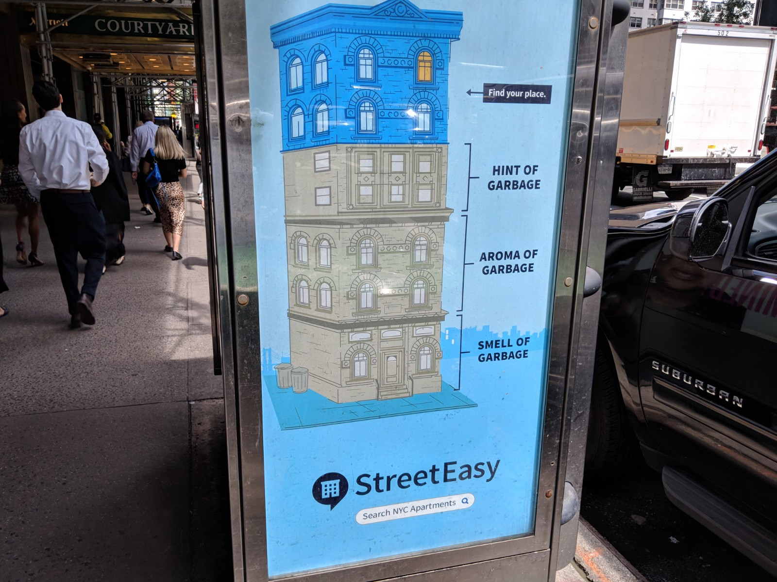 The pitch, on the street. StreetEasy's "Find your place" campaign at the time — the right apartment is the one that fits you.
A talk at GeoNYC, New York's geospatial meetup, hosted that night by Carto. I was about two years into StreetEasy, whose pitch then was that it helped you find what you were actually looking for, not just scroll an endless list — search you could shape to your own sense of the city. Custom boundaries were the literal version of that: find your spot, then look only there.
The tool itself is simple. Instead of accepting our official neighborhoods, anyone can draw their own area on the map, name it, and search inside it — one boundary or many.
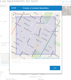 Draw your own. Sketch an area, name it, and it becomes a search filter.
By 2018 our users had quietly drawn about forty thousand of them. That struck me as a gift: forty thousand hand-drawn polygons recording how New Yorkers really carve up their city, and marking every place our neat neighborhood map let them down.
Mapping forty thousand polygons
It was also my excuse to solve a harder problem: how do you even draw forty thousand overlapping polygons on one map? Plot them the usual way and you get an ink-black smear. This is the quiet trouble with big-data visualization — the tools are few, the technique is fiddly, and the story is hard to compose — but it pays off, because a simple aggregate often hides the very thing you're after. The answer here was datashader, fairly new at the time, which I'll come back to.
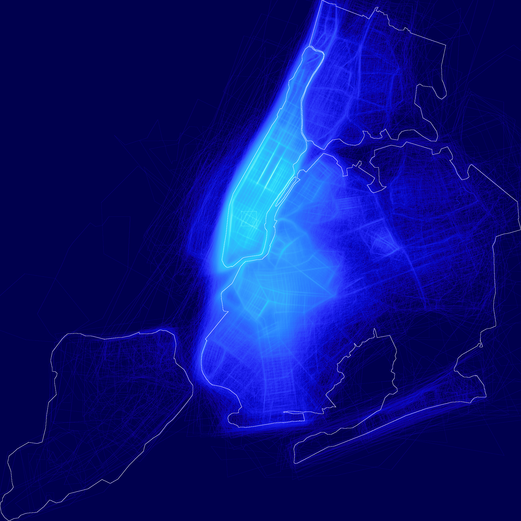
Even plotted as-is, the result was breath-taking. The structure of the city emerges on its own: people fence their searches along highways and big avenues. A few mega-polygons stretch clear across the map, drawn by people searching whole boroughs at once. And one spot in Queens lit up in a way I didn't expect.
What people draw, and what they call it
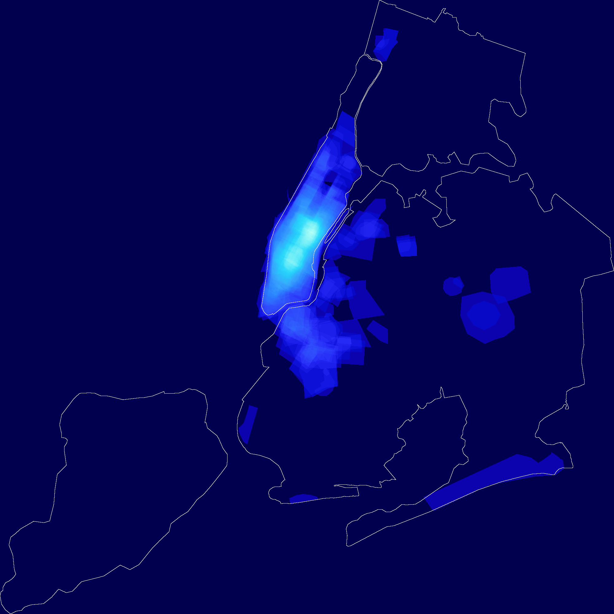 "Walkable." Named by feel — people drew rough circles, a radius around a point.
Does anyone agree with our map? Two ways to look: how far our outlines overlap what people actually draw, and what they name the places. The naming turned out to be the louder signal.
Map every boundary someone labeled "walkable" and you get a scatter of rough circles: people drew a radius around wherever they stood. Others name by anchor entirely, pinning an area to the one thing that matters to them.
A park, a grocery, a gym: the boundary follows the anchor. It's a blunt, honest read on what people actually optimize for when they choose where to live.
Forest Hills, two neighborhoods in one
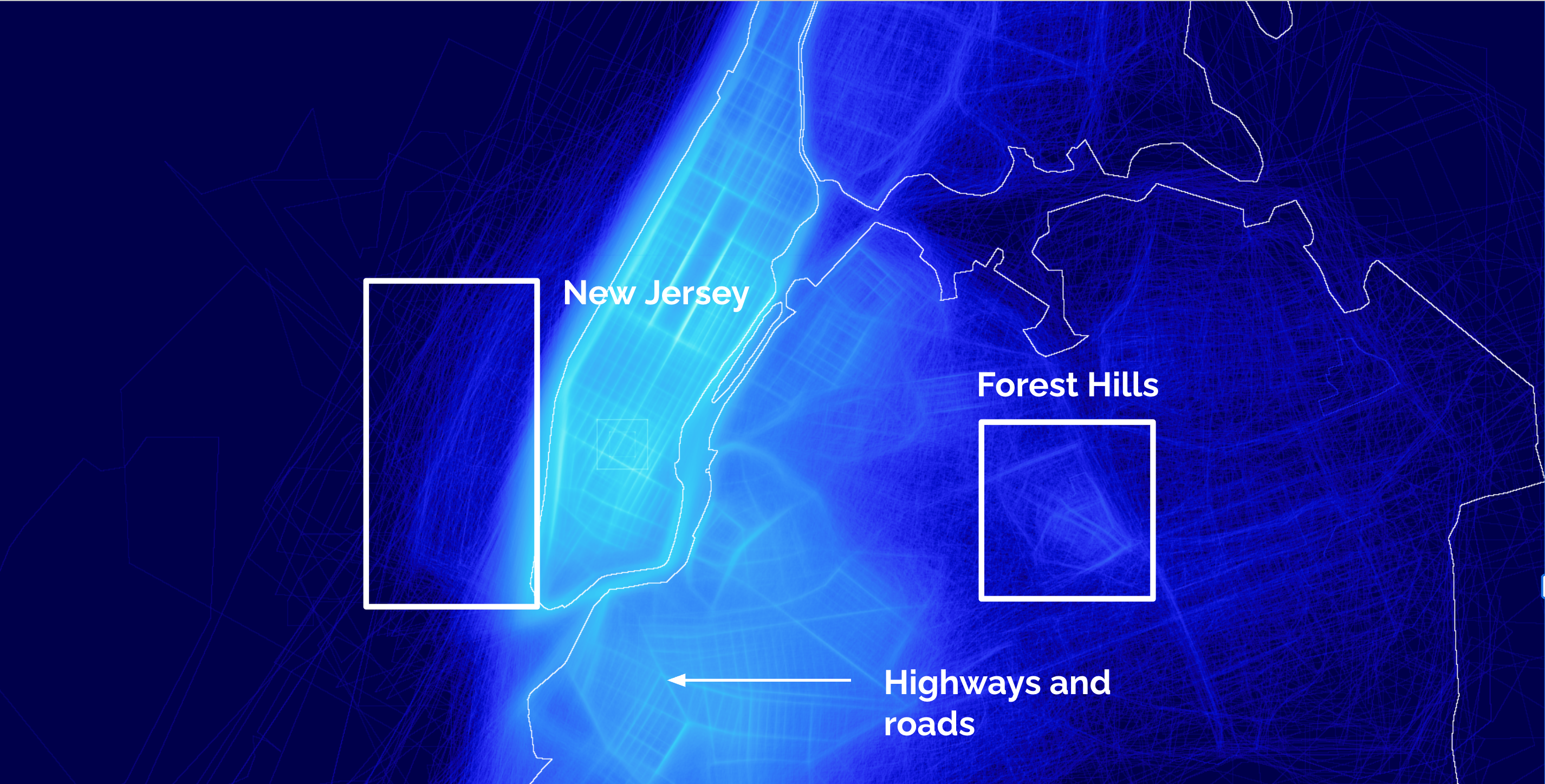
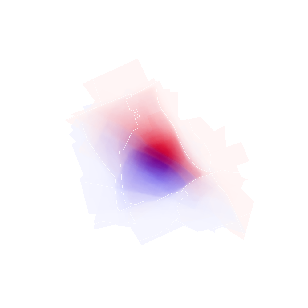 Two clusters, one name. Forest Hills splits cleanly in the data. Color of the polygon defined by center of the polygon being below or above the railroad.
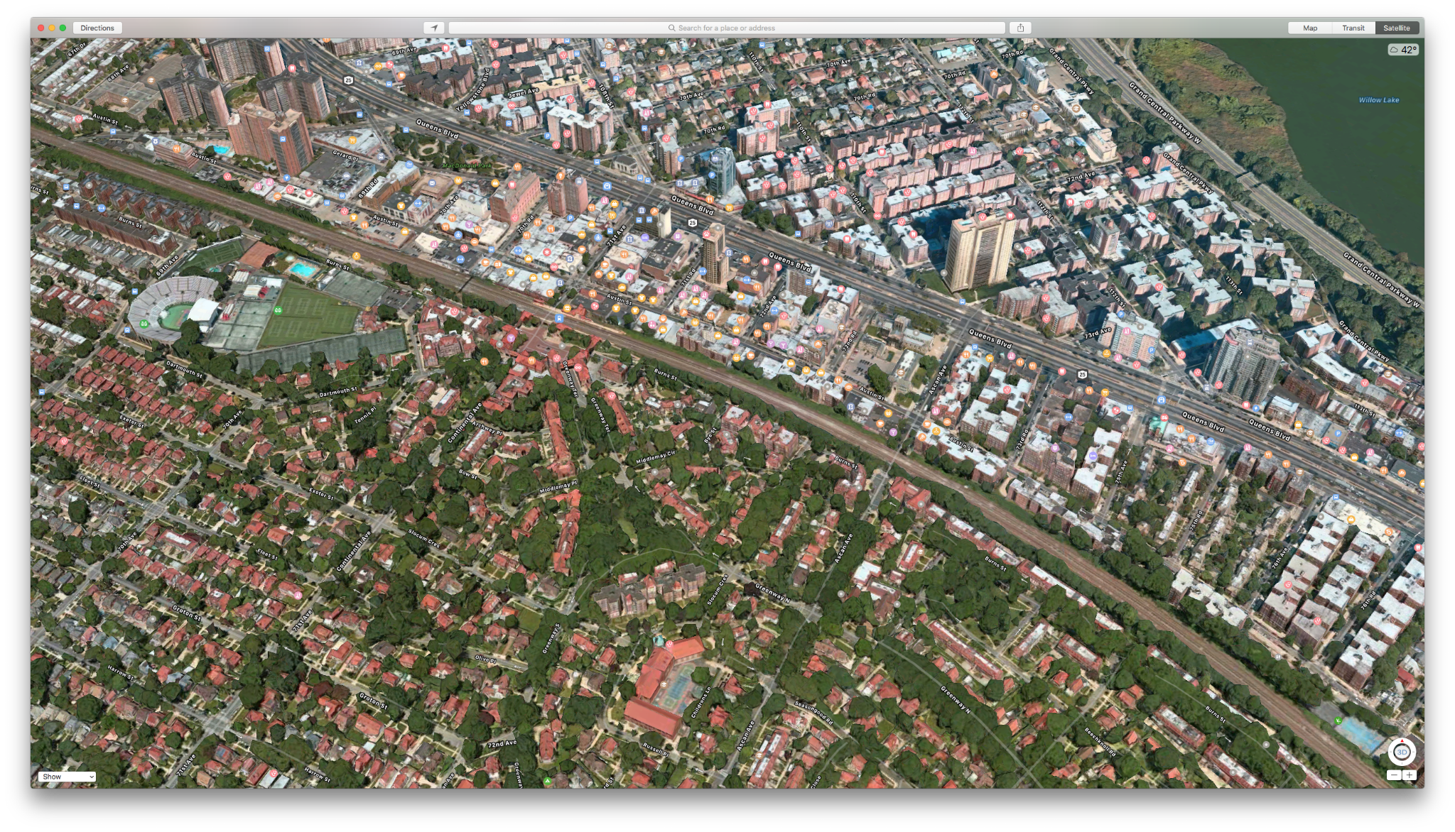
Then the real disagreement: Forest Hills, in Queens. On our map it's one clean, well-defined neighborhood. In the data it splits in two — the historic Forest Hills on one side, and a newer section across the subway and the highway, long associated with the writer Sergei Dovlatov. Our customers treat them as two places; we still file them as one.
Watching the market move
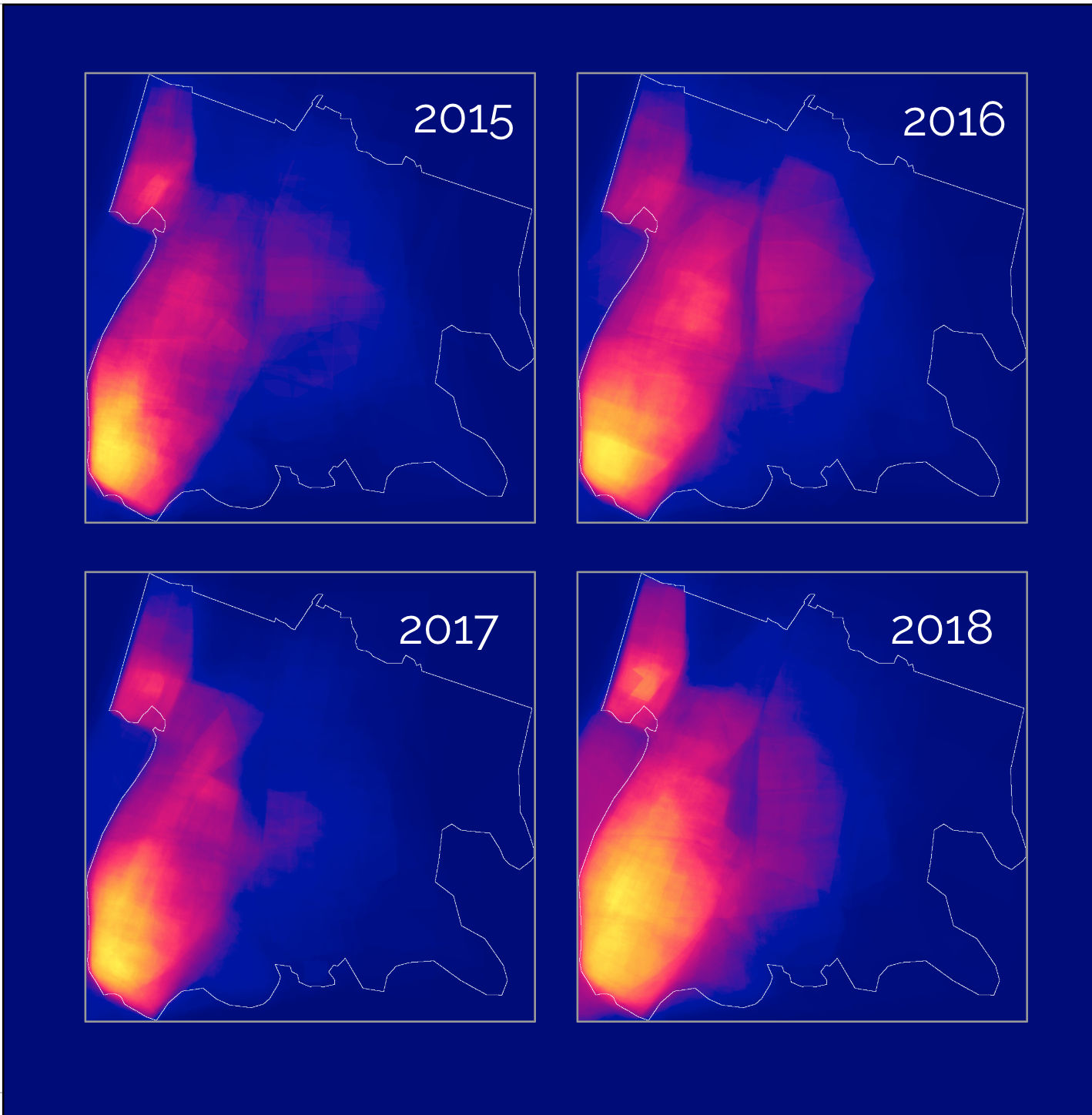 The map fills in. Custom-boundary density across the Bronx, over time.
Boundaries carry a date, so you can watch the searching itself move. Played over the years, the density creeps outward, notably across the Bronx — tracing, I'd guess, the market opening up there.
Why it took datashader
Back to the tool. Matplotlib and its kin draw each shape as an object, so forty thousand polygons either crawl or collapse into a blot. datashader inverts that: it aggregates the data into a pixel grid and colors each cell by how much falls in it, so density itself becomes the picture — exactly what you want when the truth is in the overlap, not in any single shape.
A note on method, in fairness: everything here came from looking — drawing, adjusting, looking again — rather than from hard metrics. That's both the charm and the limit. There's a second layer still buried in this data for anyone who quantifies it: area overlap between drawn boundaries and our neighborhoods, naming frequencies, agreement scores, and more.
What I took from it
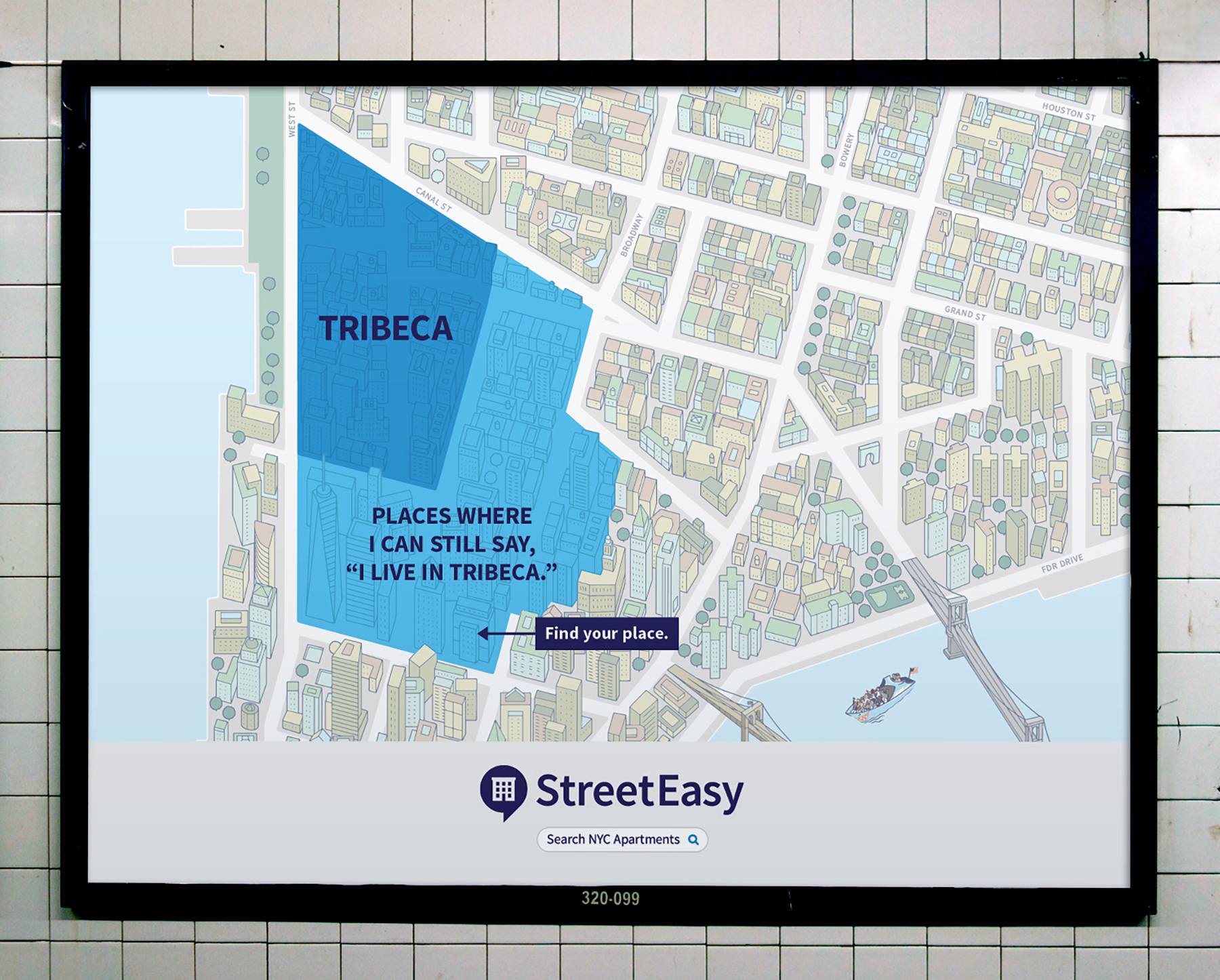 A year later. StreetEasy's advertising leaned into personal neighborhood lines — "places where I can still say I live in Tribeca."
This stays one of my favorite pieces of work — a rare case where big, messy data became legible at a glance, with no summary table standing in for it. And a year on, custom-boundary search turned up as a headline feature in StreetEasy's advertising. I can't prove my analysis drove that, but the timing was close enough to enjoy.