Declarative visualization with Vega
A talk at the NYC Data Visualization Meetup in 2018, the group then run by Naomi B. Robbins, about one family of tools — Vega, Vega-Lite, and Altair, the Python binding for them. Vega and Vega-Lite came out of the Interactive Data Lab at the University of Washington. It's easy to mistake them for yet another plotting library. Vega does sit on top of D3 and a few other existing pieces, but the rendering isn't the interesting part. What sets it apart is that it's declarative, in the spirit of ggplot's grammar of graphics.
Charts as specifications
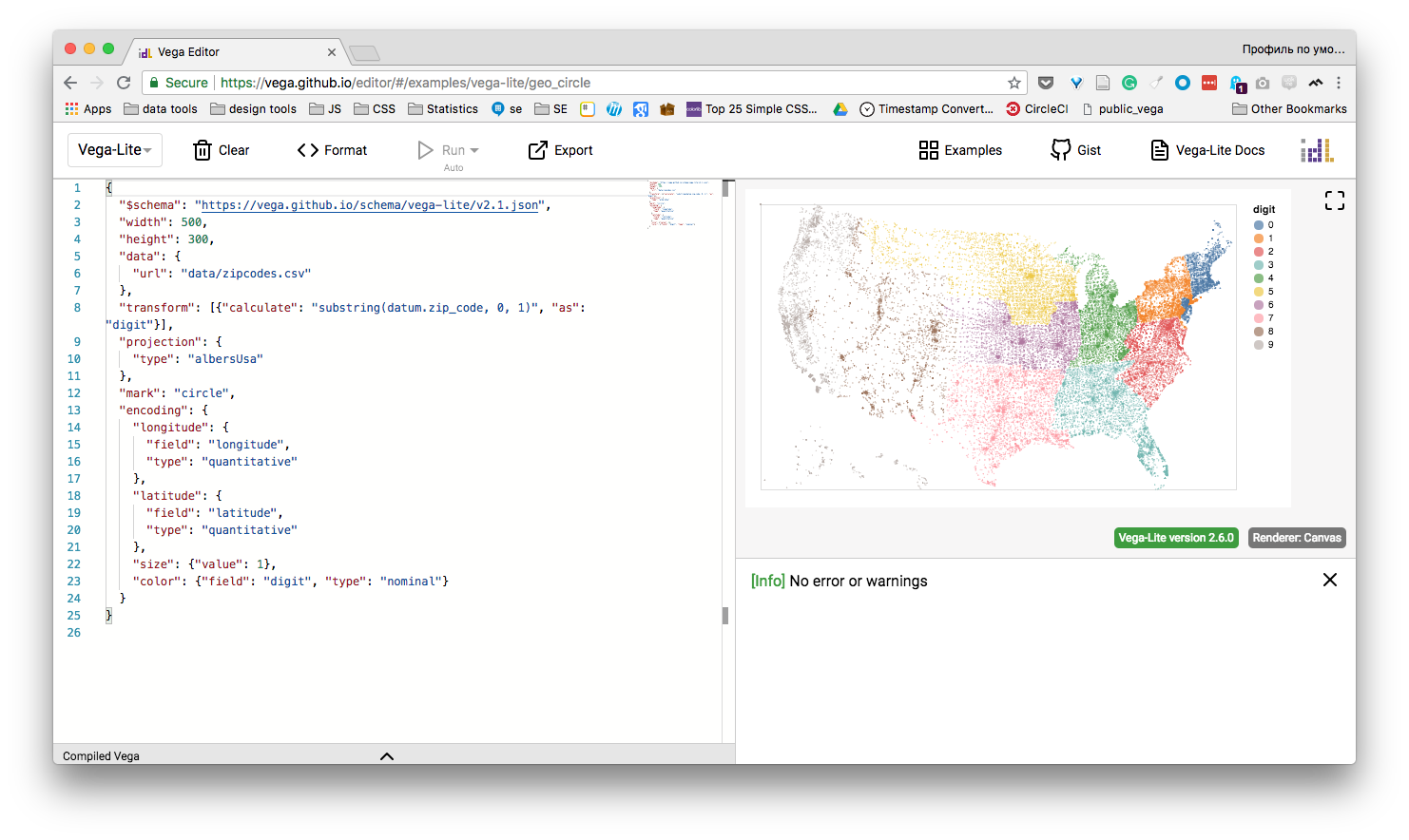
The idea is simple: you say what you want to see, not how to draw it. You write a specification of the chart, and an engine executes it. One can compare it to SQL — a shared specification accepted by multiple engines, each working differently under the hood. Spelled out, a spec reads almost like a letter:
Dear chart,
Please show me points with X on a linear scale over "Height" and Y on a linear scale over "Weight," size on a log scale by population, and color by gender, using the dataset I'm passing you.
That framing buys a clean separation of concerns, on more than one level. The spec lives outside the data, so when the data changes the chart simply re-renders. It lives outside the visuals too: a theme can be defined once, even externally, so the same chart restyles itself when you swap themes. As an analyst you stay on the meaning, and let the styling be settled once, elsewhere.
And because the thing in the middle is just a specification, a JSON file, it travels between languages and engines. That's exactly how Altair works: Python emits the spec, and the Vega engine renders it in the browser.
From notebook to live page
That portability turned out to matter well beyond a notebook. At StreetEasy I wanted one place to host embedded charts, themed consistently, where adding a new one cost almost no development, and Vega fit exactly.
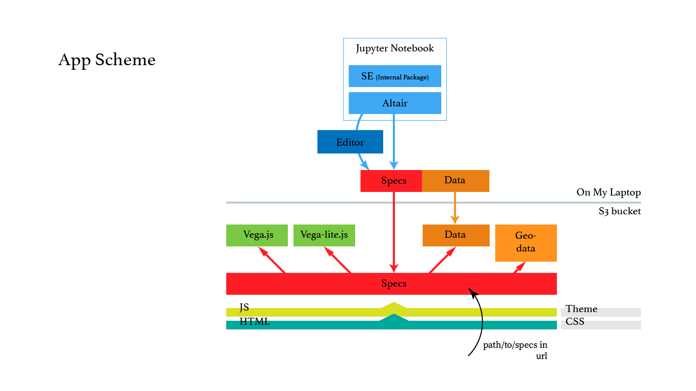
The hosting was a few small pieces. A public S3 bucket, later behind a CDN, though any static host would do. A single page that uses vega-embed to render a spec with our house theme. And the detail that made it click: that page reads a spec_path parameter from its own URL, so one deployed page can render any specification I point it at.
That indirection is the whole point. Publishing a chart never touches code or a deploy — I add a spec file and change a query parameter. Every chart is just a data file, so a new or broken one can't take down the page or disturb the ones already live. The theme is set once and shared, the data lives in the spec and can be swapped underneath, and the page is static, so it caches and scales for free. One page served any number of charts, and nothing was ever at risk.
An analyst builds the chart in a notebook with Altair, and to shave off the last step I wrote a small Python helper that exported and published it in a single line, without leaving the analysis.
In the CMS, WordPress for us, going live was then just pasting an embed pointed at the new URL.
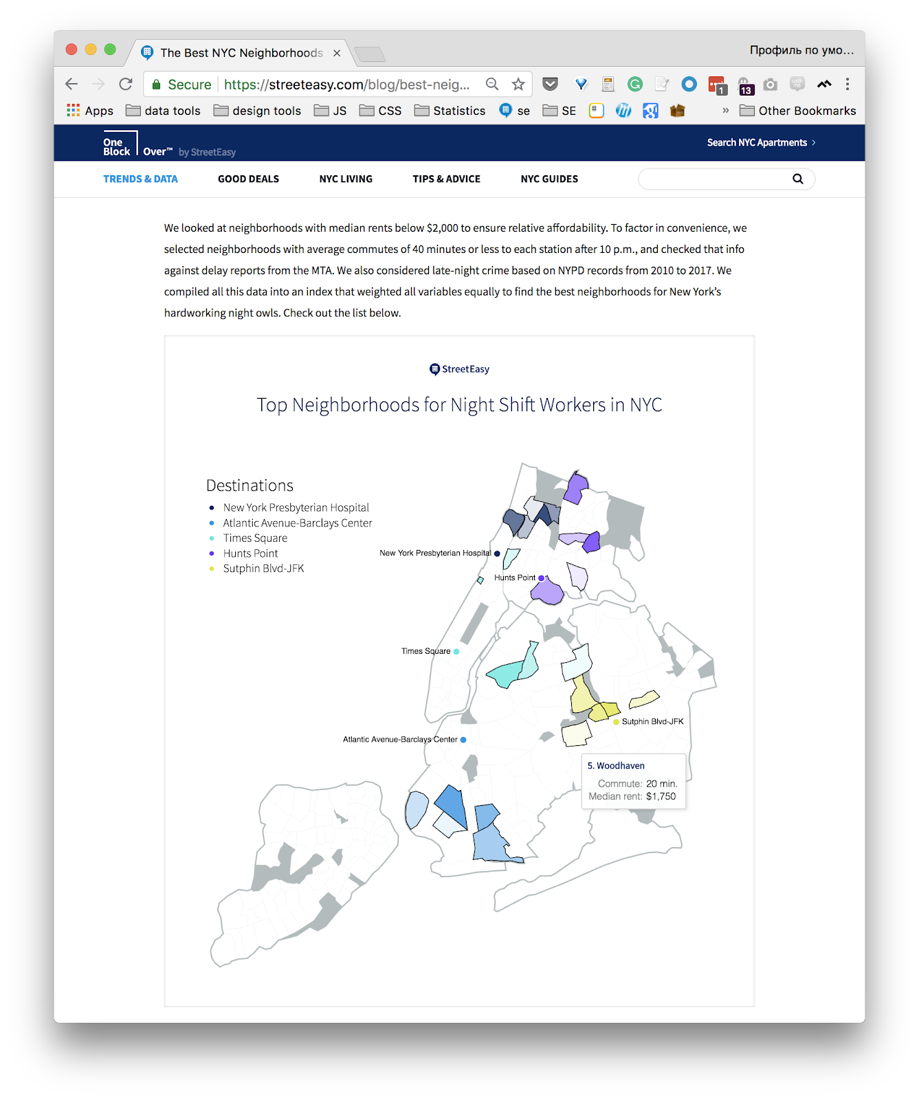
What lands on the page is live: interactive, themed to the brand, with the rich interactivity that normally takes real front-end work included by default.
Years on, the bet still reads as the right one. Separating what from how, and treating the chart itself as data, is what let a small team ship interactive graphics without standing up a front-end project behind every one. It went over well on the night, too, though I pitched it wide — more a tour of a way of thinking than a hands-on session, which asked a lot of a mixed, non-technical room.
What changed since
The tools didn't stand still. Altair picked up a prefix and is now Vega-Altair, and the whole family sits under NumFOCUS, the nonprofit behind NumPy and pandas, as a sponsored project — about as clear a signal of staying power as open source offers. Altair is on version 6 now, several major releases past what I demoed in 2018, still built on the Vega-Lite grammar underneath.
Where it went
My own path drifted away from this kind of work. The team I'm on moved from economics and day-to-day editorial content to a data-product team building actual features, so public-facing visualization isn't the daily craft anymore, and I miss it more than I'd expected. The app I built to serve these specs is still running. The engineering held up; the harder problem, which I underrated at the time, was getting non-technical colleagues to use the full range of what it offered. A spec is elegant to people who think in specs; for everyone else, the distance between possible and actually used turned out to be the real design work, and the part I'd take a different run at today.